In this post I show how to create different color palettes in Gutenberg, to – for example – allow other colors for the text than for the background.
Update from November 18, 2018: One of the latest Gutenberg updates removed the PanelColor component, so I updated the code with the instead-to-use PanelColorSettings component. That makes it easier, because it directly allows us to specify custom colors.
Update from July 11, 2018: Both color attributes need to be set as attributes in the last code block. Otherwise, the selected colors are not recognized from the color pickers after reloading the browser.
The Goal
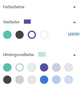
The goal was to recreate the color pickers that are available in the paragraph block:
The colors are inside an area that can be toggled, and the selected color is shown next to the title of the area. When a color is selected, the paragraph element gets a class and an inline style.
The solution
First, my solution was to use the PanelColor component, which does not allow custom colors easily, so that was a little trickier than the solution via PanelColorSettings. That component allows us to set a custom color set – but you need to define all used colors via add_theme_support( 'editor-color-palette' ), because that is what Gutenberg uses for generating the color class names.
With that, the solution is made of two parts:
- Tell Gutenberg about the wanted colors with
add_theme_support( 'editor-color-palette' ). - Recreate the color part from the paragraph block.
I assume that you have installed Gutenberg and included a JavaScript file in the editor and are already using a package.json. I am using modern JavaScript syntax, which is converted to ES5 with Babel.
Define the color palette
At first, we need to define our colors, which we want to use later:
add_action( 'after_setup_theme', 'setup_theme_supported_features' );

/**
 * Remove unused Gutenberg features.
 */
function setup_theme_supported_features() {
	add_theme_support( 'editor-color-palette',
		[
			'name' => 'Puerto Rico',
			'slug' => 'puerto-rico',
			'color' => '#53c4ab',
		],
		[
			'name' => 'Tundora',
			'slug' => 'tundora',
			'color' => '#454545',
		],
		[
			'name' => 'Butterfly Bush',
			'slug' => 'butterfly-bush',
			'color' => '#5151a0',
		],
		[
			'name' => 'White',
			'slug' => 'white',
			'color' => '#ffffff',
		],
	);

	add_theme_support( 'disable-custom-colors' );
}Code language: PHP (php)
The JavaScript part
Besides Gutenberg components, we need the classnames library. To install it, we run the following command in our command line:
npm install classnamesCode language: Bash (bash)Now let us begin with the external things, that we need to import into the JavaScript file:
import classnames from 'classnames';

const {
	registerBlockType,
} = wp.blocks;
const {
	InspectorControls,
	InnerBlocks,
	withColors,
	getColorClass
} = wp.editor;
const {
	PanelBody,
	withFallbackStyles,
	PanelColor,
	ColorPalette,
} = wp.components;

const {
	compose,
	Component,
} = wp.element;

const {getComputedStyle} = window;

const FallbackStyles = withFallbackStyles((node, ownProps) => {
	const {textColor, backgroundColor} = ownProps.attributes;
	const editableNode = node.querySelector('[contenteditable="true"]');
	//verify if editableNode is available, before using getComputedStyle.
	const computedStyles = editableNode ? getComputedStyle(editableNode) : null;
	return {
		fallbackBackgroundColor: backgroundColor || !computedStyles ? undefined : computedStyles.backgroundColor,
		fallbackTextColor: textColor || !computedStyles ? undefined : computedStyles.color,
	};
});Code language: JavaScript (javascript)
Like already written, the solution is composed of existing Gutenberg components – that said, those definitions and the withFallbackStyles() function in the paragraph block and the PanelColor component.
Like it is made in the paragraph block, we will define the edit part of our block as a subclass of Component:
class OneColumnBlock extends Component {
	constructor() {
		super(...arguments);
	}

	render() {
		const {
			attributes,
			setAttributes,
			mergeBlocks,
			onReplace,
			className,
			backgroundColor,
			textColor,
			setBackgroundColor,
			setTextColor,
			fallbackBackgroundColor,
			fallbackTextColor,
			fallbackFontSize,
		} = this.props;

		const textColors = [
			{
				name: 'Tundora',
				slug: 'tundora',
				color: '#454545'
			},
		];
		const backgroundColors = [
			{
				name: 'Puerto Rico',
				slug: 'puerto-rico',
				color: '#53c4ab'
			},
			{
				name: 'Butterfly Bush',
				slug: 'butterfly-bush',
				color: '#5151a0'
			},
			{
				name: 'White',
				slug: 'white',
				color: '#ffffff'
			}
		];

		return (
			<div
				className={classnames(className, {
					'has-background': backgroundColor.value,
					[backgroundColor.class]: backgroundColor.class,
					[textColor.class]: textColor.class,
				})}

				style={{
					backgroundColor: backgroundColor.value,
					color: textColor.value,
				}}
			>
				<InnerBlocks/>
				<InspectorControls>
					<PanelColorSettings
						title="'Farbschema"
						colorSettings={[
							{
								colors: textColors,
								label: 'Textfarbe',
								onChange: setTextColor,
								value: textColor.color,
								disableCustomColors: true,
							},
							{
								colors: backgroundColors,
								label: 'Hintergrundfarbe',
								onChange: setBackgroundColor,
								value: backgroundColor.color,
								disableCustomColors: true,
							}
						]}
					/>
				</InspectorControls>
			</div>
		);
	}
}Code language: JavaScript (javascript)
Interesting is the render part. The constants at the beginning are from the paragraph block – textColors and backgroundColors are our subsets of the colors defined in add_theme_support( 'editor-color-palette' ).
In the return part, we open a div, in which the class names and the inline styles are outputted. This is also taken from the paragraph component. InnerBlocks is a component, that enables it to insert other blocks into a block, and after that inside InspectorControls we create our color pickers with the PanelColorSettings component.
First, we define the title of the panel and pass an array of objects via colorSettings, where each object stands for one color picker. colors allows us to set a custom set of colors (the default colors would be the ones from the add_theme_support( 'editor-color-palette' ) part) – the first one gets our text color, and the second one our background colors.
label is the – well – label of the individual color picker, and onChange gets the functions that save the colors (taken from the paragraph block). The value is the hex value and we want to disable that the user can select a custom color.
One last piece of code remains – also inspired by the paragraph component:
export default registerBlockType('slug/one-column', {
	title: 'Eine Spalte',
	icon: 'admin-post',
	category: 'layout',
	edit: compose([
		withColors('backgroundColor', {textColor: 'color'}),
		FallbackStyles,
	])(OneColumnBlock),
	save: props => {
		const {
			backgroundColor,
			textColor,
			customBackgroundColor,
			customTextColor,
		} = props.attributes;

		const textClass = getColorClass( 'color', textColor );
		const backgroundClass = getColorClass( 'background-color', backgroundColor );

		const className = classnames( {
			'has-background': backgroundColor || customBackgroundColor,
			[ textClass ]: textClass,
			[ backgroundClass ]: backgroundClass,
		} );
		return (
			<div className={className}>
				<InnerBlocks.Content/>
			</div>
		);
	},
});
Code language: JavaScript (javascript)
Here we register our block slug/one-column and set a few meta data. edit is our OneColumnBlock class and in save we build the color classes and set them for a div container, that wraps the content of the InnerBlocks.
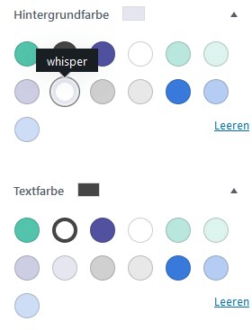
And that is the result (I have a few more colors in the project that used in the example):
Thank you for sharing this! I've been trying to re-create this block in particular for the color palette panel and have had some very tough struggles getting it to work.
Happy it was helpful, thanks for your comment!
This is a little off topic but I also found a way to create column block templates that are ready when you add the block to the editor. I posted how I did it on this forum. Just wanted to share since your block uses InnerBlocks.
https://javascriptforwp.com/forums/topic/custom-column-block-gutenberg-3-0-using-innerblocks-with-pre-nested-blocks/
Hi Florian,
as far as I understand the above is code for a certain block.
How would I adapt the code to make sure the new defined colours are showing in each block which supports colour settings?
Hi Sascha,
as far as I know you cannot specify different color sets for text/background in a way that makes the core blocks like paragraph use them. The colors defined in
add_theme_support( 'editor-color-palette' );are used for all color controls by default.Best,
Florian